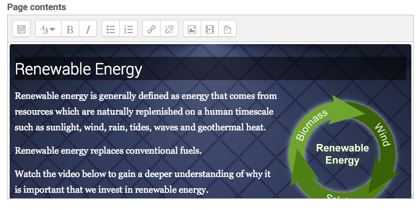
Not many Moodlers use the Lesson Activity in Moodle. Mostly because it’s neither a brilliant quiz engine nor a replacement for the book module. But when you combine both these elements and spend a bit of time on the design you can create engaging, interactive learning packages that can stand their own against popular content creation tools, and best of all, it’s authored natively in Moodle.
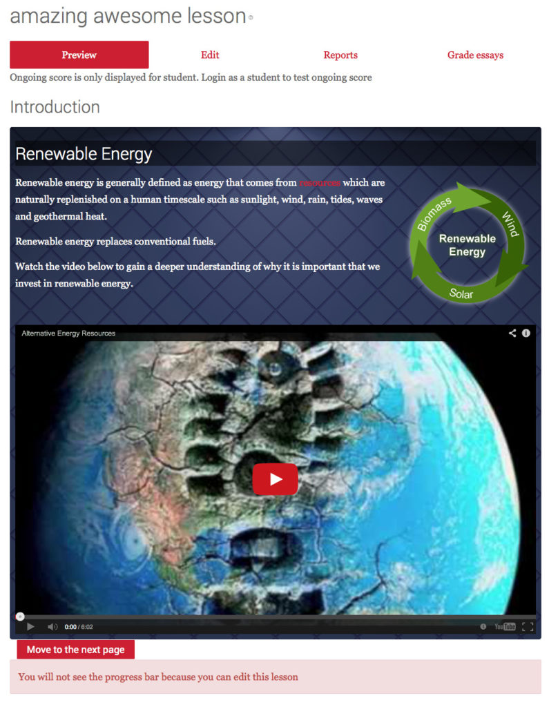
Yes, the screenshot above really is the Moodle lesson module, and I’ll show you how and why it’s so brilliant.
OK, so we can’t compete with Storyline or Captivate’s simple tech-free authoring, but these products cost money, and Moodle certainly has tools that can produce stunning learning packages.
Let’s look at the benefits/features of using the lesson module:
- Include a file popup – such as a supporting word doc or PDF, similar to what Storyline lets you do with resources
- Display a progress bar (which by the way can be styled to high heaven with CSS to look funky with gradients)
- Display an on-going score to learners so they can see their grade
- Can be set to work like a slideshow/stage with fixed height so it feels more like a Powerpoint or SCORM package
- Can be a timed activity
- Can be password protected
- Availability can be based upon completing a previous lesson – very powerful feature
- Availability can also be based upon the time spent on a previous lesson – perfect for Online Guided Learning Hours (UK requirement)
- Allows for multiple attempts and limited retries (fully configurable)
- In-built quiz with multiple question types
- Ability to import questions from other platforms
- Branching and clustering – allows for random quiz slides
- Workflows and pathways – learners can see different slides depending on the answers to a question – can be made interactive and personal.
- Can be linked to outcomes for improved reporting
- Has its own reporting tools
- Links with the Moodle gradebook
I bet many tutors are not aware of all the above features, and when you read these back, it sounds awfully like a commercial learning designer tool.
HTML5 Authoring and responsive scalability
It’s all about HTML5 these days and support for multiple devices. And it comes standard with the Lesson Activity. If you use a responsive theme (one built on Bootstrap) then you are good to go.
Styling the lesson module
Out of the box, it can look a bit drab, but with a bit of CSS and an SVG scalable background, suddenly things become interesting.
For this lesson I added a <div> to the content and used a responsive SVG image for the background. This image will scale up and down beautifully. The SVG is created via CSS (see http://www.svgeneration.com/resources) for a demo on how to do this and also choose from a whole heap of pre-made SVG backgrounds). SVG’s are awesome, and you can even animate them..more on this later.
Dynamic Content
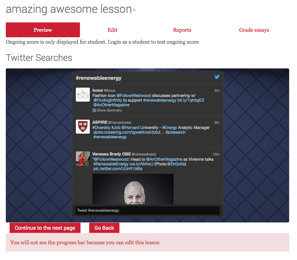
As you may be aware, embedding external media into Moodle is awesome. And with the lesson activity it’s no different. You can add dynamic content into your lessons from Youtube, Pinterest or Twitter (and many more).
So your slides can change each time a user sees them. Also, you can manage some of the content externally, outside of Moodle, and the changes appear as if by magic inside the lesson.
The screenshot below shows how I used Twitter in my lesson:
Scalable and responsive dynamic content
When you embed external media such as Youtube, the embed tag often sets the stage size. The drawback of this is that when you scale the page down to a smaller size, the video doesn’t scale accordingly, and overlaps the page. Which looks..well… a bit shoddy.
However, we can fix this with a bit of CSS (see http://avexdesigns.com/responsive-youtube-embed) . We simply place our embed in a new <div>, add some CSS, remove the size from the <embed> and voila, a fully resizable YouTube video that scales full width on a desktop and looks extremely slick on a phone too.
Slideshare
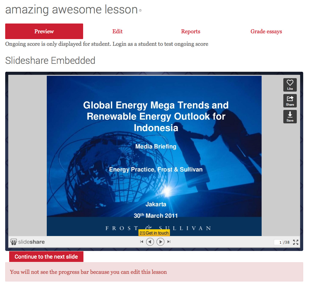
If you need to add more complexity to your lessons, but need to save time and indeed the number of lesson slides, then why not embed your Slideshare presentations? This is like having a mini lesson, inside a lesson. And again, if you apply the responsive CSS to the embed then it fills the screen beautifully. Clicking on the grey borders to the left or right of the slide deck allows the user to move back and forth through the presentation – on the iPad, this is amazing. Again the full size responsive class has made this possible on all devices.
Quiz Slides
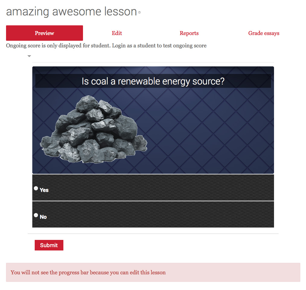
Moodle Lesson quiz slides don’t have to look awful either, the same design concepts can apply to these slides too. All it takes is a bit of CSS love and away you go. As shown below:
Templates
But this is way too hard for tutors to do right? Well, not if we use templates. It is possible to create a Master Lesson Template, one with all the bells and whistles. With the <divs> in the right place, and the CSS all ready to go. We can then import this template
lesson into any course and use it as a blueprint for tutors to build their own. As all the markup is in the HTML view, the tutor just needs to use the WYSIWYG editor to change text and replace images. Yes, they may break some markup but that’s what Moodle admins can help with.
Fully iPad Ready
As we are using HTML and some responsive elements, lessons look amazing on the iPad. The fixed height stops the content from scrolling, and the buttons sit nice at the bottom of the screen, it can be made to look like a native app.
The future
Unfortunately the Moodle Lesson module doesn’t have much CSS markup that we can take advantage of. I wish it had as we could style the heck out of it without doing any of these little hacks. However, it may come. And if it does, then the theme can determine the style of lesson headers, lesson images, backgrounds and a whole host of other awesome elements including buttons, progress bars, scoring and reporting. The possibilities are endless.
The CSS markup I used
In case you want to give this a try, here is the CSS I used:
.answeroption {
margin-top: 2px;
color: #fff;
padding: 5px;
background-color: undefined;background-image:url('data:image/svg+xml;base64,PHN2ZyB4bWxucz0naHR0cDovL3d3dy53My5vcmcvMjAwMC9zdmcnIHdpZHRoPSczMDAnIGhlaWdodD0nMzAwJz4KCTxkZWZzPgoJCTxsaW5lYXJHcmFkaWVudCBpZD0nZycgIHgyPScwJyB5Mj0nMTAwJSc+CgkJCTxzdG9wIG9mZnNldD0nMCUnIHN0eWxlPSdzdG9wLWNvbG9yOiMyZTJlMmU7c3RvcC1vcGFjaXR5OjEnIC8+CgkJCTxzdG9wIG9mZnNldD0nMTAwJScgc3R5bGU9J3N0b3AtY29sb3I6IzIyMjIyMjtzdG9wLW9wYWNpdHk6MScgLz4KCQk8L2xpbmVhckdyYWRpZW50PgoJCTxwYXR0ZXJuIGlkPSdiJyBwYXR0ZXJuVW5pdHM9J3VzZXJTcGFjZU9uVXNlJyB4PScwJyB5PScwJyB3aWR0aD0nMjAnIGhlaWdodD0nMTAnIHZpZXdCb3g9JzAgMCAyMCAxMCcgPgoJCQk8cmVjdCBmaWxsPSd1cmwoI2cpJyB4PSc5JyB5PSctNicgd2lkdGg9JzEyJyBoZWlnaHQ9JzEyJy8+CgkJCTxyZWN0IGZpbGw9J3VybCgjZyknIHg9JzknIHk9JzUnIHdpZHRoPScxMicgaGVpZ2h0PScxMCcvPgoJCQk8cmVjdCBmaWxsPSd1cmwoI2cpJyB3aWR0aD0nMTAnIGhlaWdodD0nMTAnLz4KCQk8L3BhdHRlcm4+IAoJCTxmaWx0ZXIgaWQ9J2Z1enonIHg9JzAnIHk9JzAnPgoJCQk8ZmVUdXJidWxlbmNlIHR5cGU9J3R1cmJ1bGVuY2UnIHJlc3VsdD0ndCcgYmFzZUZyZXF1ZW5jeT0nLjIgLjMnIG51bU9jdGF2ZXM9JzUnIHN0aXRjaFRpbGVzPSdzdGl0Y2gnLz4KCQkJPGZlQ29sb3JNYXRyaXggdHlwZT0nc2F0dXJhdGUnIGluPSd0JyB2YWx1ZXM9JzAnLz4KCQk8L2ZpbHRlcj4KCTwvZGVmcz4KCTxyZWN0IHdpZHRoPScxMDAlJyBoZWlnaHQ9JzEwMCUnIGZpbGw9J3VybCgjYiknLz4KPHJlY3Qgd2lkdGg9JzEwMCUnIGhlaWdodD0nMTAwJScgZmlsdGVyPSd1cmwoI2Z1enopJyBvcGFjaXR5PScwLjEnLz4KPC9zdmc+Cg==');
}
.video-container {
 position: relative;
 padding-bottom: 56.25%;
 padding-top: 30px; height: 0; overflow: hidden;
}

.video-container iframe,
.video-container object,
.video-container embed {
 position: absolute;
 top: 0;
 left: 0;
 width: 100%;
 height: 100%;
}
.customlesson {
padding: 10px;
border-radius: 5px;
color: #fff;
background-color: #39466b;background-image:url('data:image/svg+xml;base64,PHN2ZyB4bWxucz0naHR0cDovL3d3dy53My5vcmcvMjAwMC9zdmcnIHdpZHRoPScxMDAlJyBoZWlnaHQ9JzEwMCUnPgoJPGRlZnM+CgkJPHBhdHRlcm4gaWQ9J3RpbGUnIHBhdHRlcm5Vbml0cz0ndXNlclNwYWNlT25Vc2UnIHdpZHRoPSc3NScgaGVpZ2h0PSc3NScgdmlld0JveD0nMCAwIDUwIDUwJz4KCQkJPGxpbmUgeDE9JzEnIHkxPScwJyB4Mj0nNTEnIHkyPSc1MCcgc3Ryb2tlPScjMTkyMDNkJyBzdHJva2Utd2lkdGg9JzInLz4KCQkJPGxpbmUgeDE9JzQ5JyB5MT0nMCcgeDI9Jy0xJyB5Mj0nNTAnIHN0cm9rZT0nIzE5MjAzZCcgc3Ryb2tlLXdpZHRoPScyJy8+CgkJCTxsaW5lIHgxPSc1MCcgeTE9JzAnIHgyPScwJyB5Mj0nNTAnIHN0cm9rZT0nIzMxMzc2Mycgc3Ryb2tlLXdpZHRoPScyJy8+CgkJCTxsaW5lIHgxPScwJyB5MT0nMCcgeDI9JzUwJyB5Mj0nNTAnIHN0cm9rZT0nIzMxMzc2Mycgc3Ryb2tlLXdpZHRoPScyJy8+CgkJPC9wYXR0ZXJuPgoJCTxyYWRpYWxHcmFkaWVudCBpZD0nbCcgY3g9JzUwJScgY3k9JzIwMCUnIGZ5PScwJyByPScyMDElJz4KCQkJPHN0b3Agb2Zmc2V0PScwJScgc3R5bGU9J3N0b3AtY29sb3I6I2ZmZjsgc3RvcC1vcGFjaXR5Oi4xOycgLz4KCQkJPHN0b3Agb2Zmc2V0PScxMCUnIHN0eWxlPSdzdG9wLWNvbG9yOiMwMDA7IHN0b3Atb3BhY2l0eTowLjE7JyAvPgoJCQk8c3RvcCBvZmZzZXQ9JzMwJScgc3R5bGU9J3N0b3AtY29sb3I6IzAwMDsgc3RvcC1vcGFjaXR5OjAuMzsnIC8+CgkJCTxzdG9wIG9mZnNldD0nOTAlJyBzdHlsZT0nc3RvcC1jb2xvcjojMDAwOyBzdG9wLW9wYWNpdHk6MC41NTsnIC8+CgkJCTxzdG9wIG9mZnNldD0nMTAwJScgc3R5bGU9J3N0b3AtY29sb3I6IzAwMDsgc3RvcC1vcGFjaXR5Oi42JyAvPgoJCTwvcmFkaWFsR3JhZGllbnQ+Cgk8L2RlZnM+Cgk8cmVjdCBmaWxsPScjMzk0NjZiJyB3aWR0aD0nMTAwJScgaGVpZ2h0PScxMDAlJy8+Cgk8cmVjdCBmaWxsPSd1cmwoI3RpbGUpJyB3aWR0aD0nMTAwJScgaGVpZ2h0PScxMDAlJy8+Cgk8cmVjdCB3aWR0aD0nMTAwJScgaGVpZ2h0PScxMDAlJyBmaWxsPSd1cmwoI2wpJy8+Cjwvc3ZnPg==');
}
.customlesson h3 {
color: #fff;text-shadow: 1px 1px #000;background:#7f7f7f;
 background:rgba(0,0,0,0.5);
}
Extending this idea and taking it further
With SVG’s its possible to add animation, which means we can add some interesting effects to our images. HTML5 also allows us to animate using CSS3, so although we won’t get Disney, we can certainly start to create simple web animations. So there is no reason why we cannot have page headings that fade in, images that slide across, interactive rollovers and even clickable layers. OK, it would be cumbersome to do in the HTML window I know, but if you had pre-defined classes and the CSS in place then adding such effects wouldn’t be a huge job once you have it all set up and ready.
Thanks for reading this post. I hope it’s given some food for thought and above all I hope it inspires the Moodle Community to push the envelope with the Lesson Activity.
Moodle really is a powerful bit of kit. And if you are willing to push the boundaries then you will see just how flexible it can be. Native Content Authoring that looks slick, job done.

