Many moons ago I blogged about what Moodle could look like if it looked and felt like Netflix. At that time, it was just an idea. Then one day, with some spare time on my hands, I worked with my colleagues Charles Horton and Mark Gash to build it. We didn’t spend long on it, it was simply a proof-of-concept, but it looked great, and I thought I would share it here.
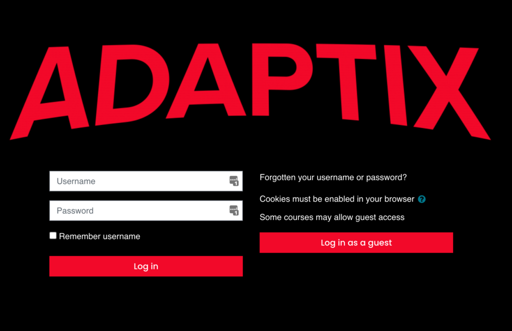
First up we needed a really simple login page:
Nothing more than a branded core Moodle login page, it’s the use of colours and the logo that make this work.
Then a really cool dashboard (myMoodle) page:
This uses some funky javascript to pull the course image in and the course description is added to the top of the page when the mouse rolls over each cover.
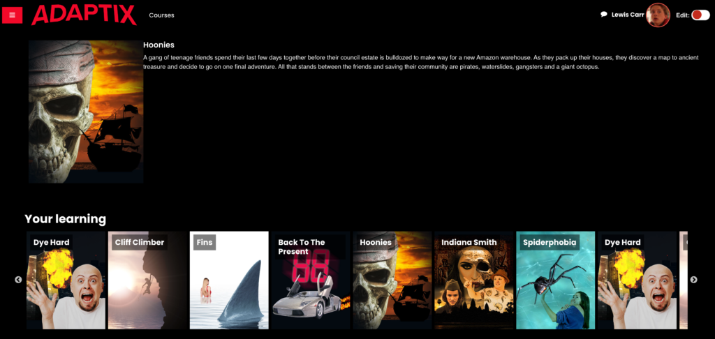
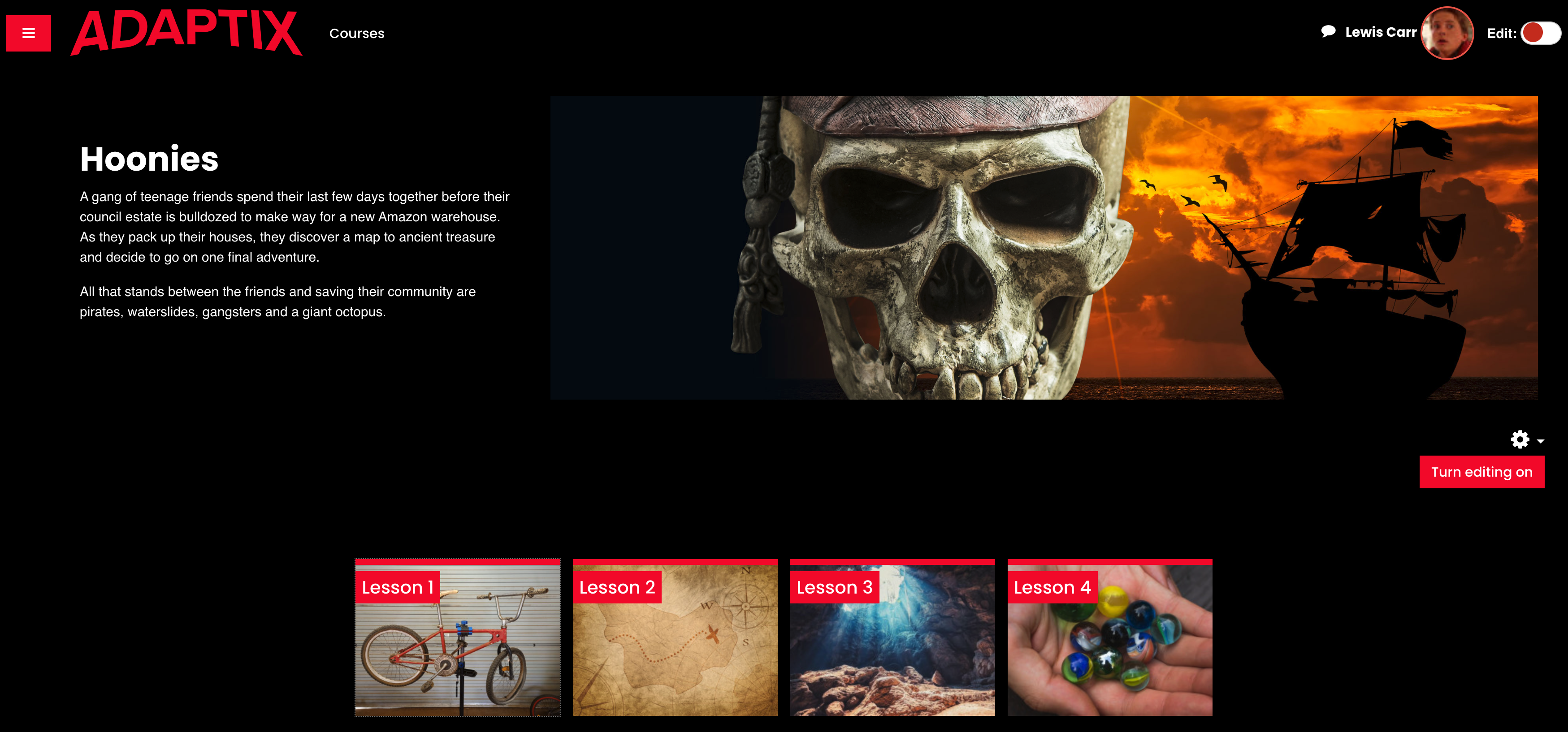
Then finally, the awesome course page:

The tiles all have interactions when you move over them, and the title and description of the movie or course change on a mouse rollover. So the learner knows exactly what each course or module is without clicking into it. We used the wonderful Moodle Tiles Format by David Watson for the topic content.
So there you have it, a funky Moodle-Netflix concept. I’ve included a video below so you can see it in action.