For the past few weeks I have been developing a new responsive theme for Moodle 2 as part of my role at Leeds College of Music. The framework is complete it’s now just a matter of further tweaking the CSS as I drive down the various levels in Moodle.
The aim of the theme is to create an environment that looks and feel like an app, regardless of the platform, and above all, create something that is engaging to both Higher and Further Education students.
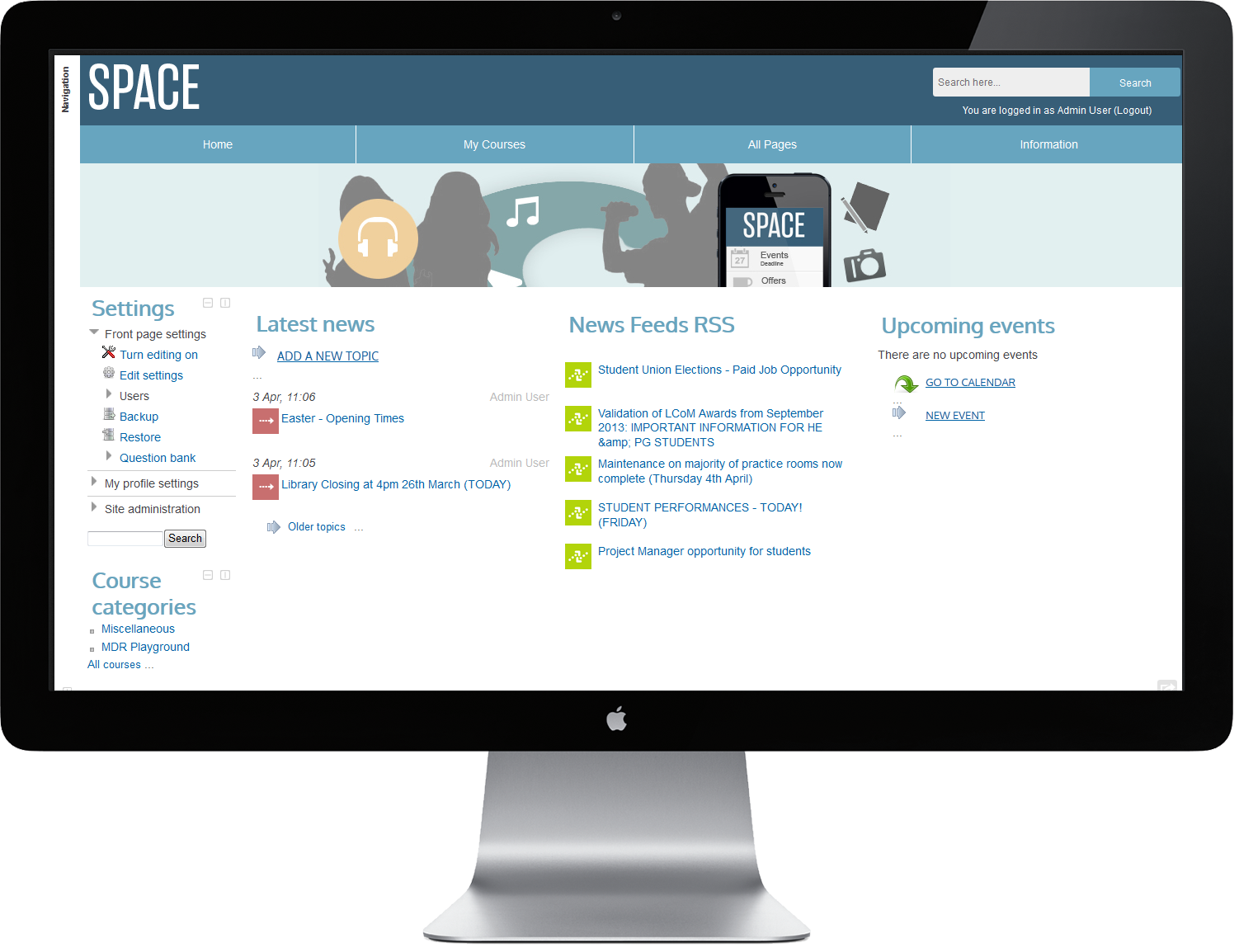
The front page:
The front page needs to be fresh, simple and inviting. With clear navigation, clean white space and generous padding. Yet at the same time, bearing in mind how it renders on a smaller screen. The search box in the top right links to a custom site search block that I am creating alongside the theme. This will allow users to search courses, users, news posts and documents all from one box. The results returned will be dependent on the courses the user has access to.
Mobile phone display:
Designing for mobile is at the top of the priority list, switching between the various platforms during development is essential. The site needs to feel organic on the phone so that users will want to use it (think ebay or Facebook). The blocks are automatically shifted to the bottom of the screen whilst the main content takes center stage. Thus reducing the need to scroll.
The menu is also responsive and uses JQuery to collapse the elements and provide a toggle switch (similar to Bootstrap).
The theme also cleverly removes any clutter such as the breadcrumb bar and editing options and these become nestled in the header, tapping the header reveals more advanced Moodle options.
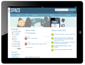
Tablet:
Designing for the tablet is easier as there is more screen space to play with. In order to achieve this I ensured that the blocks are re-sizable so on smaller tablets 1 or 2 columns are shown (i.e in portrait mode) and 3 or more are shown on wider displays (i.e landscape or high-res displays).
Other Considerations/design elements:
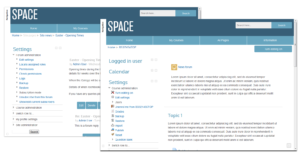
Styling the buttons and forms is essential if I want to make the theme look more bespoke and less “Moodley”. I am using a separate stylesheet for this task. Changing the Turn Editing On button to look like an app button with “roll-over states” makes it a much more pleasant experience and more obvious to the user.
I have changed the icon size of the resources and activities to 32×32 and added more padding so that they stand out.
I still have a long way to go, the left blocks still need work to make them look modern as do the standard Moodle menus. These may become full width elements with rollover states. There is the danger of over complicating the theme and loosing the simple clean lines that white space provides but at the same time, too simple can be conceived as too boring.
I aim to have the theme installed at my institution for the summer. Along with a whole plethora of new funky Moodle mods, hacks, tweaks and blocks. Simplicity and ease of use is essential, stripping out clutter with the theme needs to be done rather than core code hacks.


