Over the past few years, I’ve been spending a lot of playing with the code that powers the Moodle Mobile App, and although it’s relatively simple to brand (i.e colour changes, images icons etc..) it still could do with a major overhaul. Moodle (out of the box) generally suffers a bit and can sometimes look dated and “clunky”.
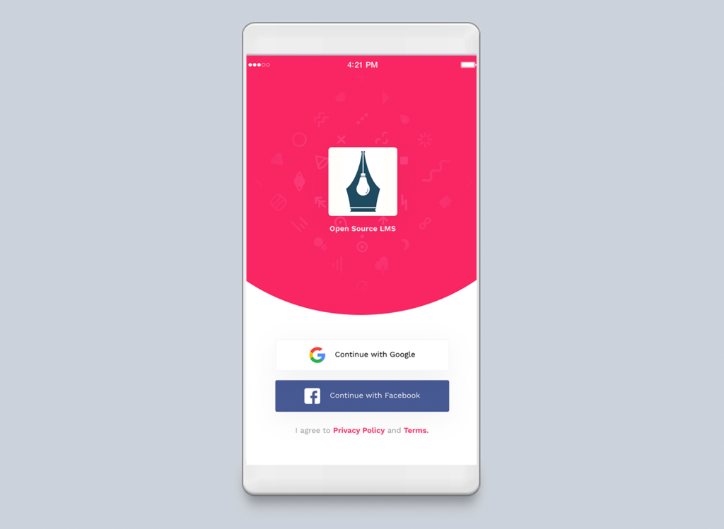
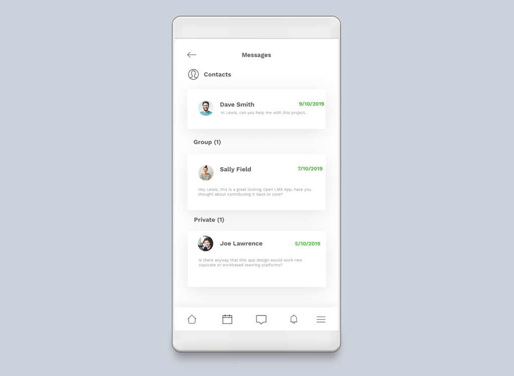
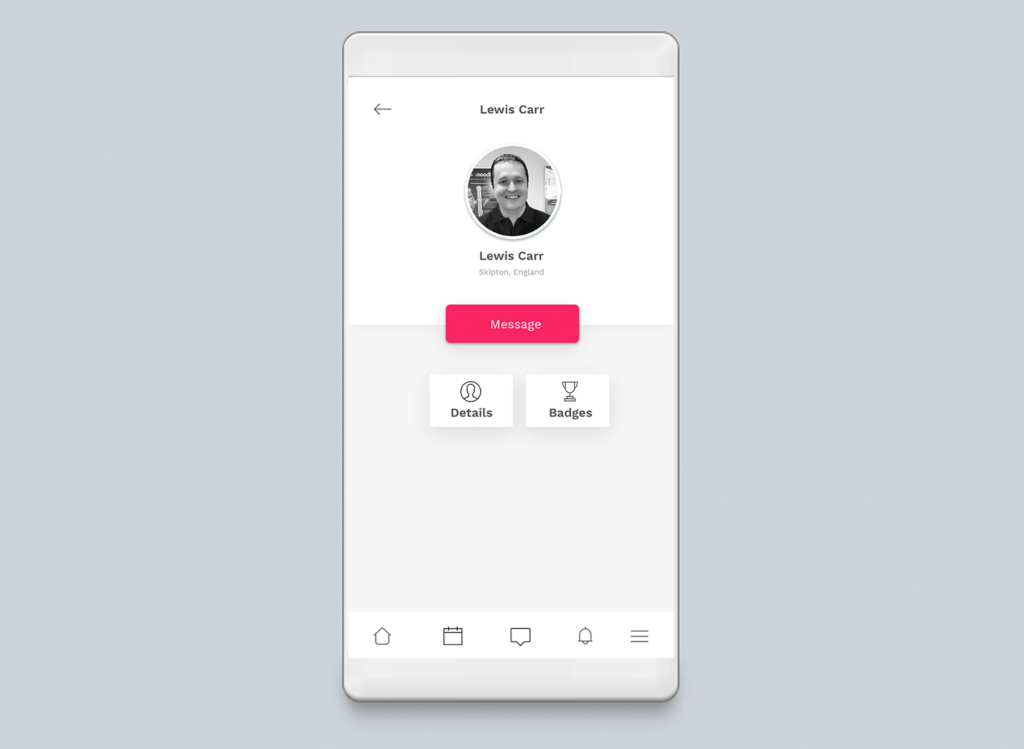
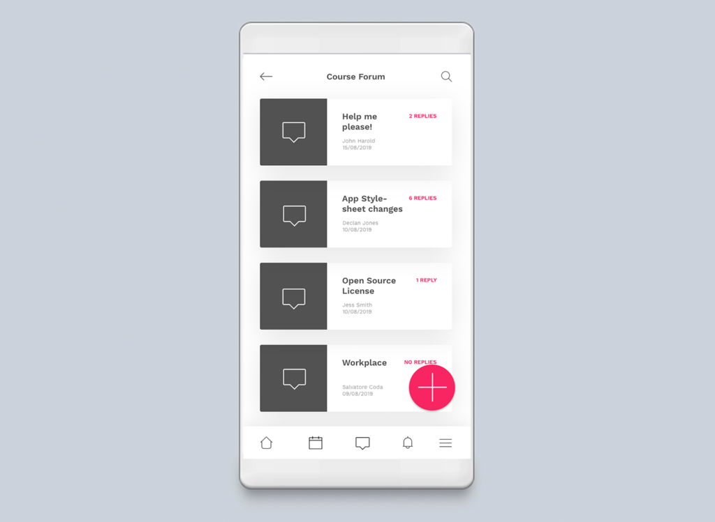
So, I’ve begun a new project using the Open Source code provided by the Moodle project. This is what I’ve come up with so far. Once I finalise a design I’ll be rewriting some of the templates and crafting a whole new stylesheet.

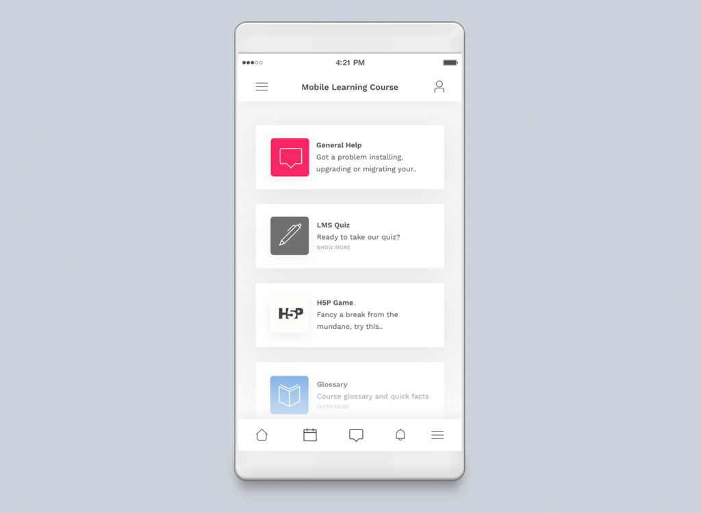
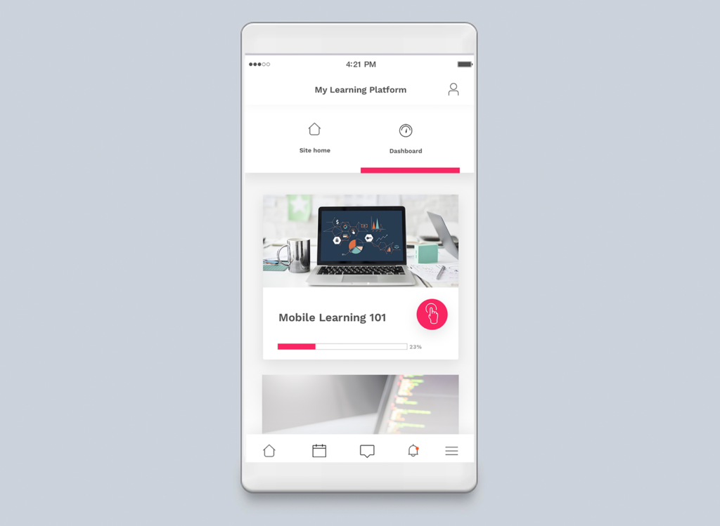

Here’s a video of it so you can see how it all comes together.


