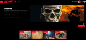
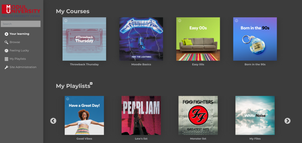
Recently, we developed a Moodle UX that works like any popular streaming music site. Where courses are albums (with album artwork) and resources are tracks, each with custom and editable icons. Lastly, we created a playlist feature whereby teachers and students can create custom playlists and add resources to them which can then be shared with other users on the site.
Here’s how it looks:
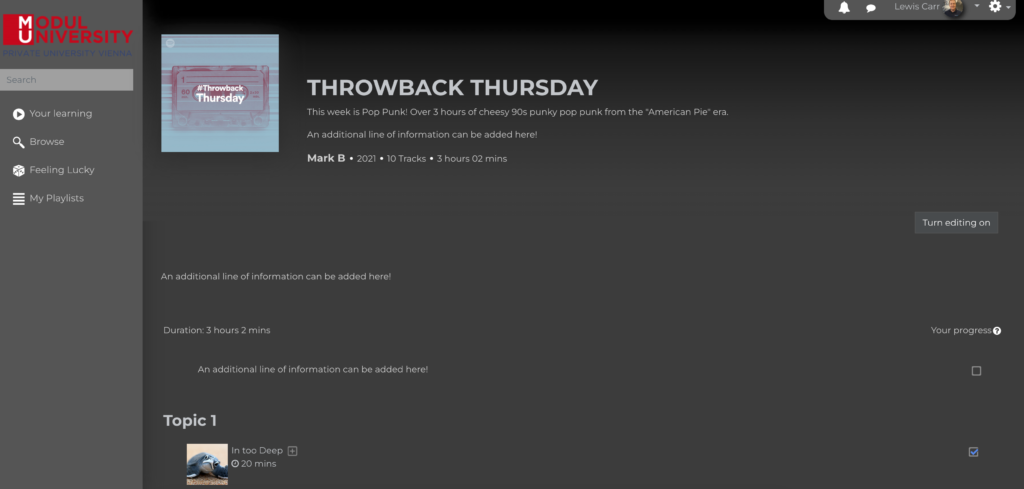
When inside a course, all resources are time-tagged, and the total time of all the resources informs the student how long the course will last. It lists the number of tracks (resources) along with the summary.
Teachers can upload custom artwork for activities, so instead of using Moodle icons for PDFs, for example, every PDf on the course can have its own unique icon/image. Pretty cool eh?
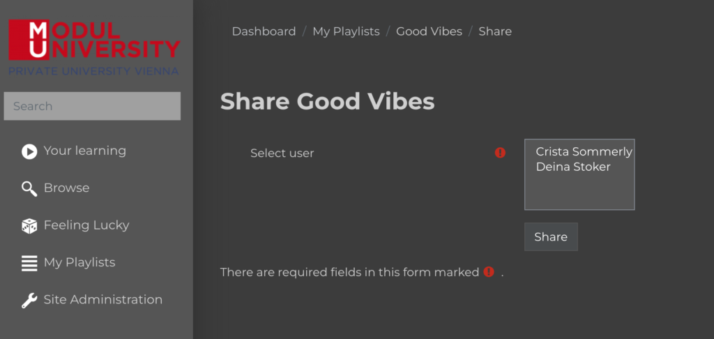
Students can create their own playlists. So they could, for example, add all their assignments from all of their courses into one “Assignment Playlist“. Or create a playlist called “Things I need to do this week“.
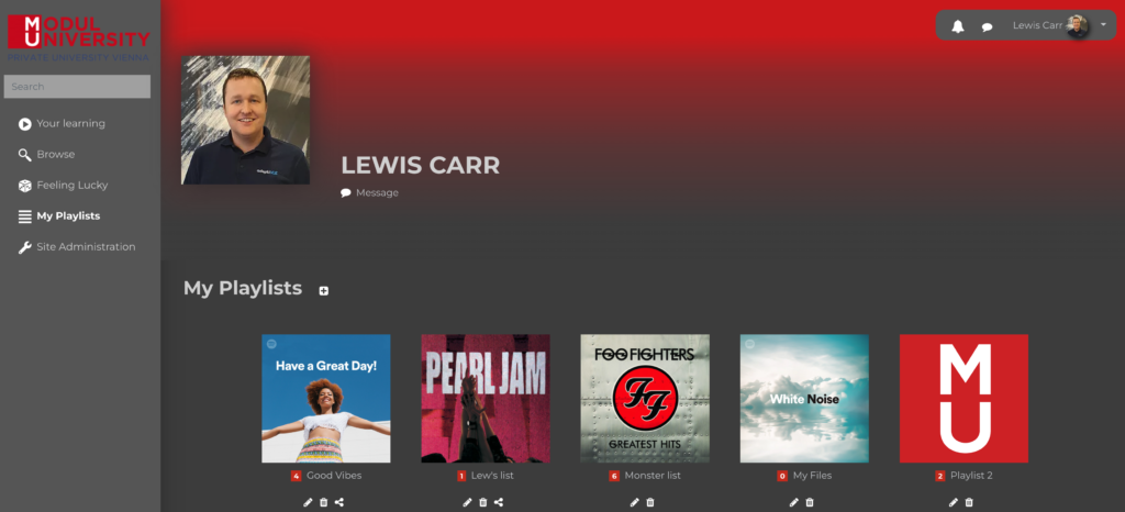
They can share playlists with classmates too!
Currently, this Moodle site actually delivers music production courses, so it fits it perfectly. But the concepts can be applied to other subjects too. For example, construction or health care. A student may be enrolled on multiple construction courses and need a way to organise their own learning. So instead of wading through courses, and scrolling through topics, they can add them with a single click and store them in one place. And because it feels “familiar”, and not like an LMS, then users adopt it really quickly.
Other features include:
– A random (feeling lucky) button that selects a resource not yet completed, just for fun!
– An upcoming assignments block on the dashboard
– A block that pulls all new resources across all enrolled courses into a simple to-do list
– Plus a whole bunch of other cool stuff (enough to be blog posts in their own right)

